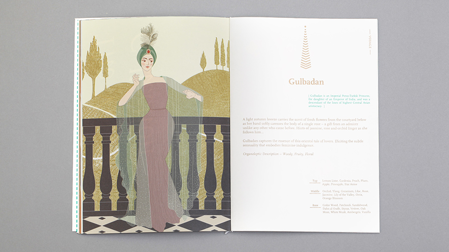
Olfactory Tales
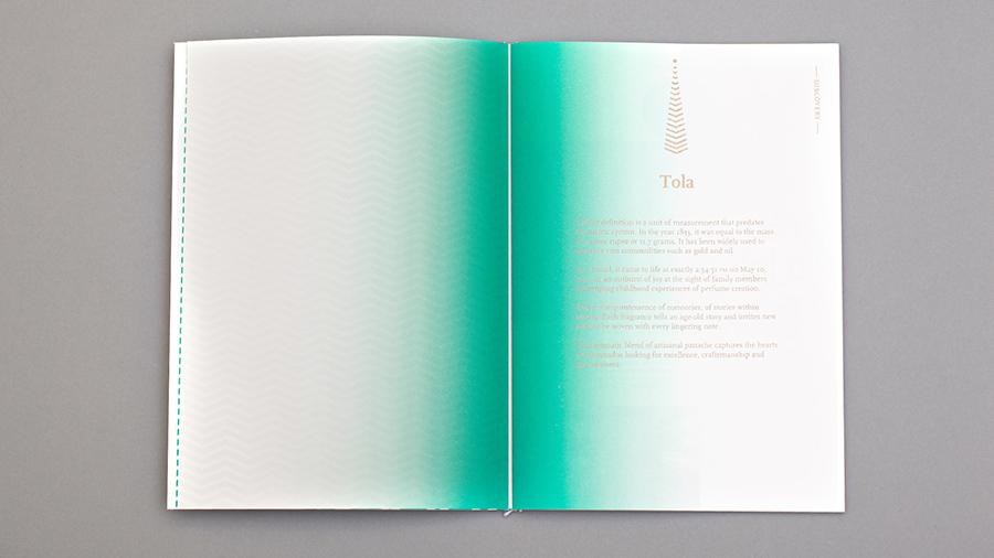
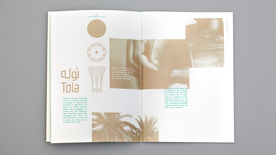
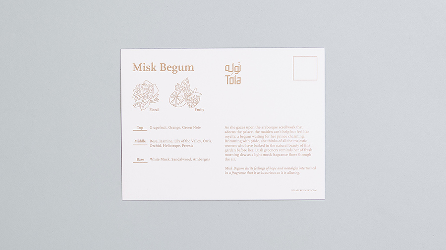
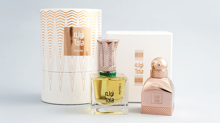
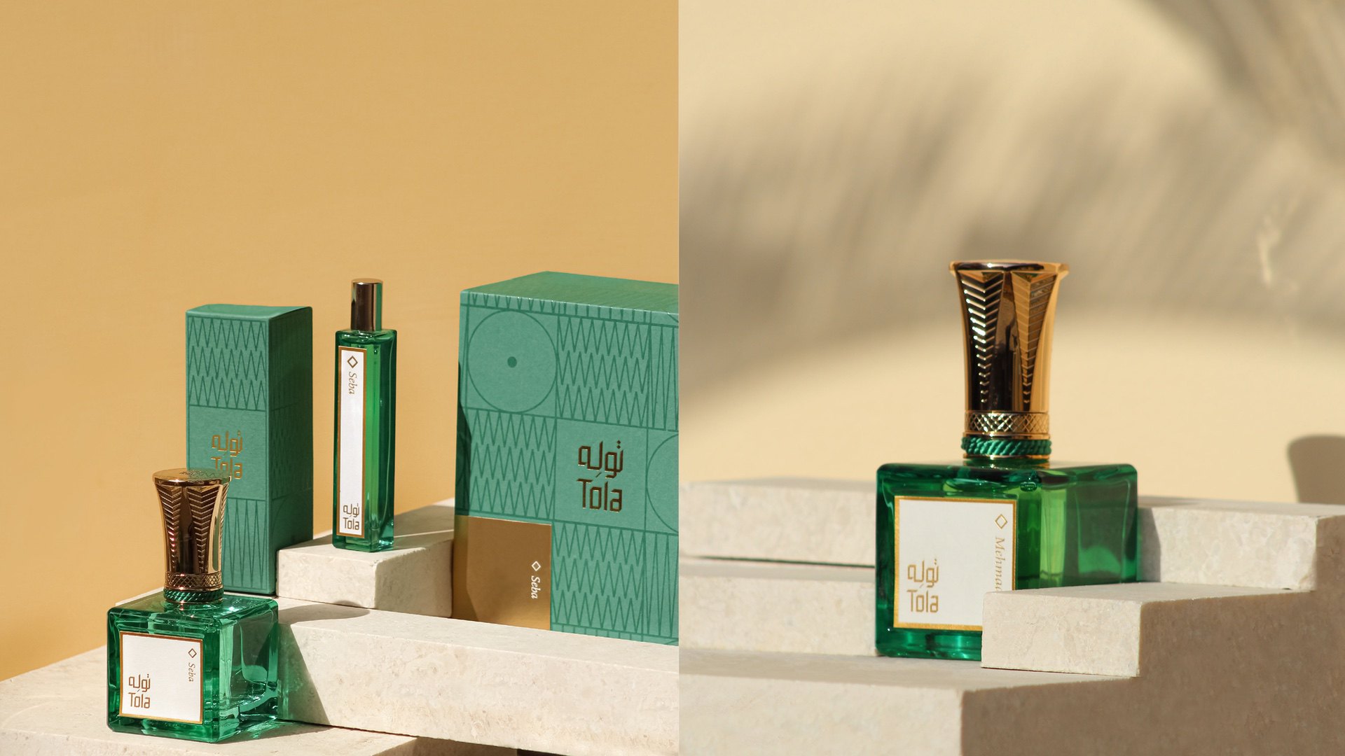
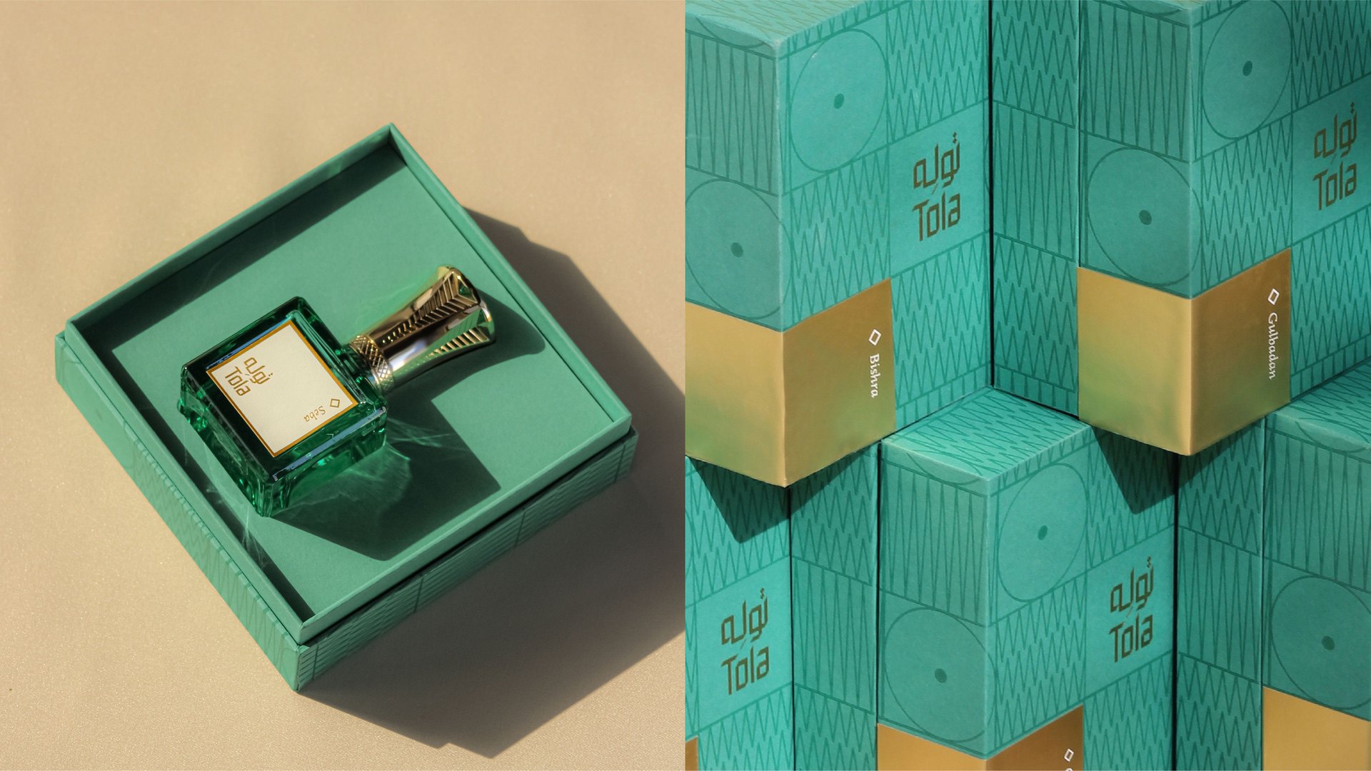
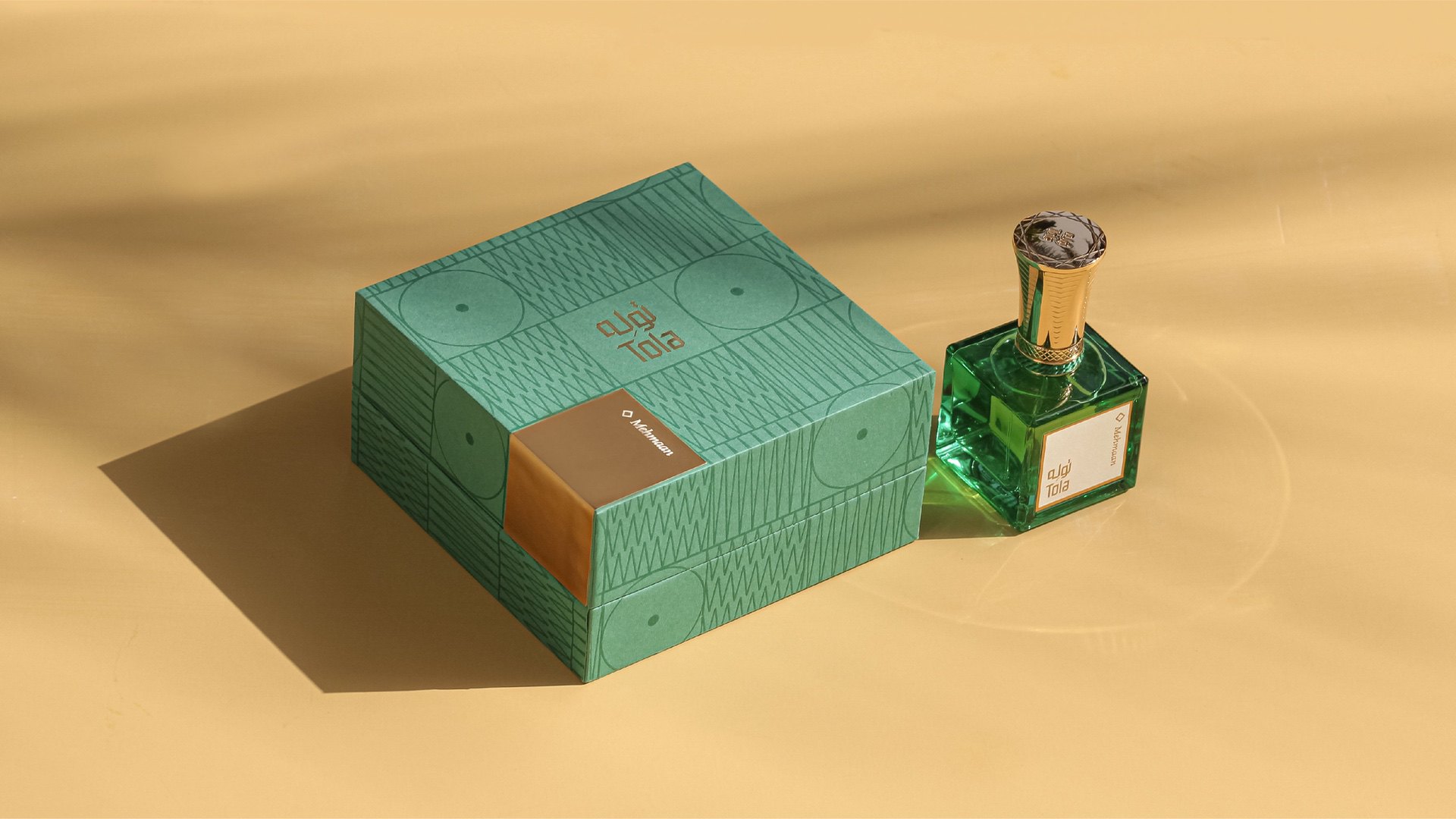
Tola
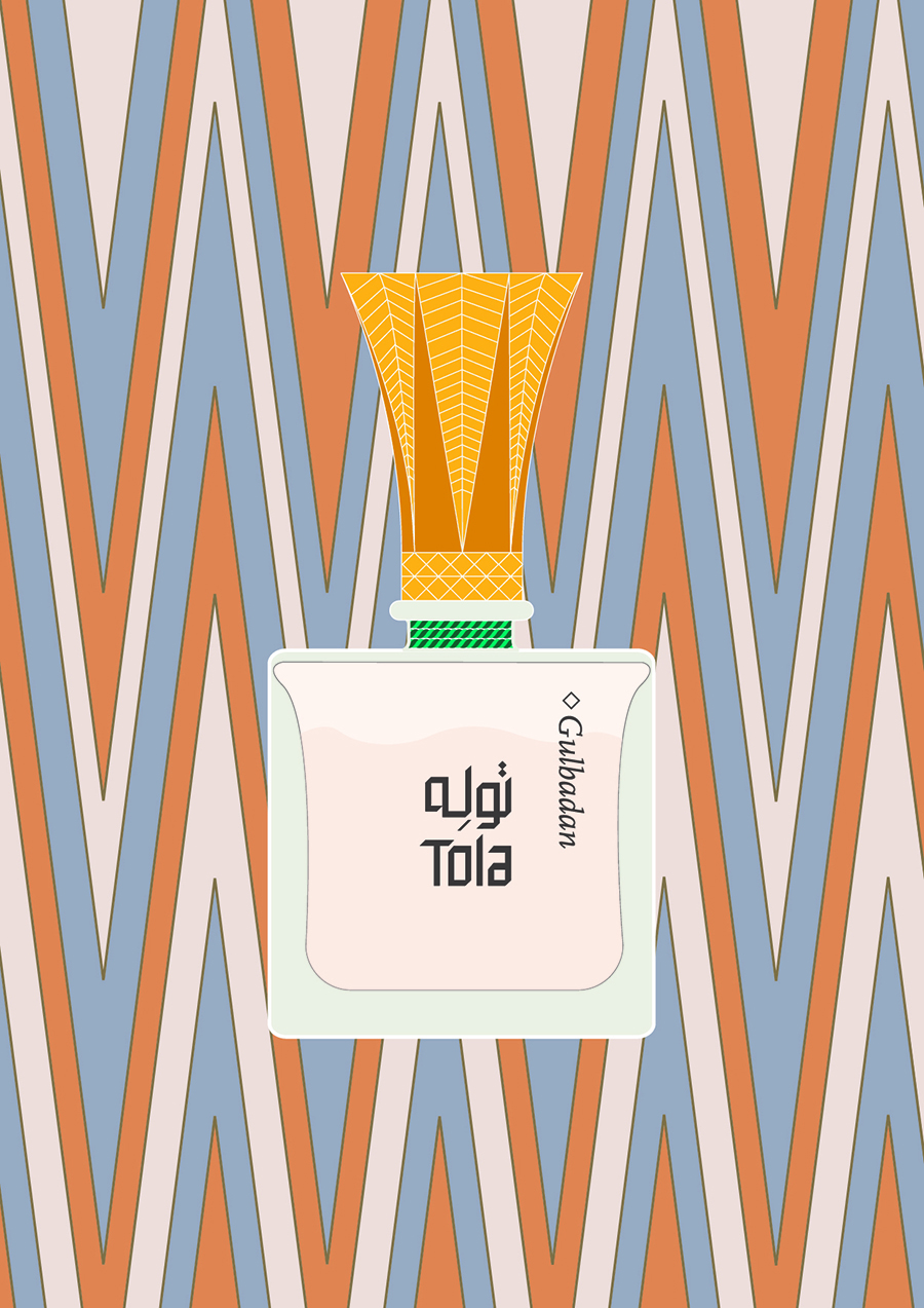
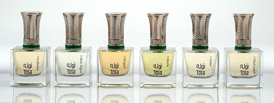
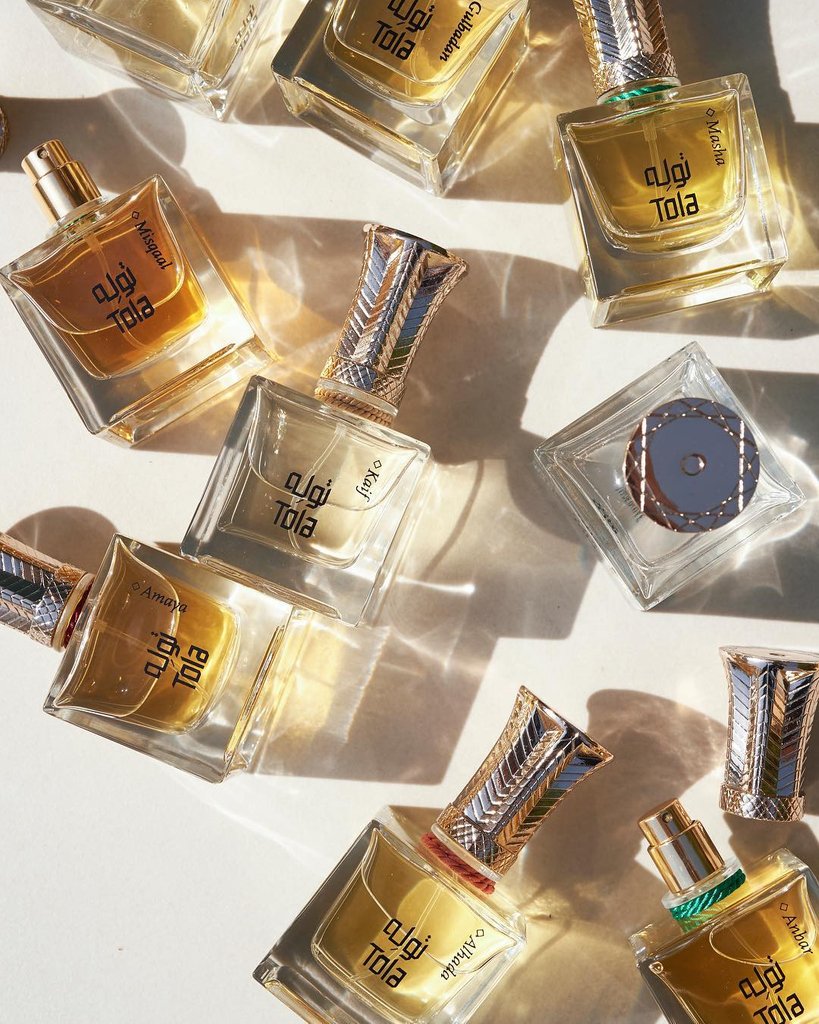
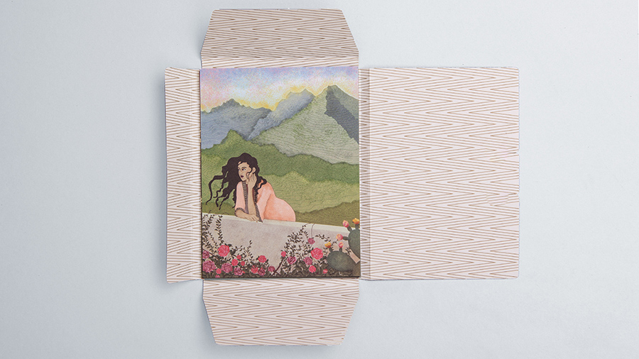
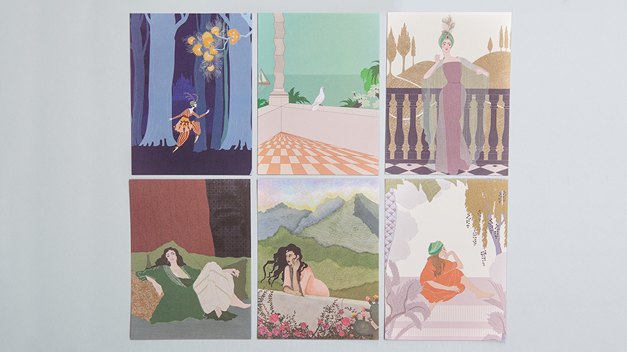
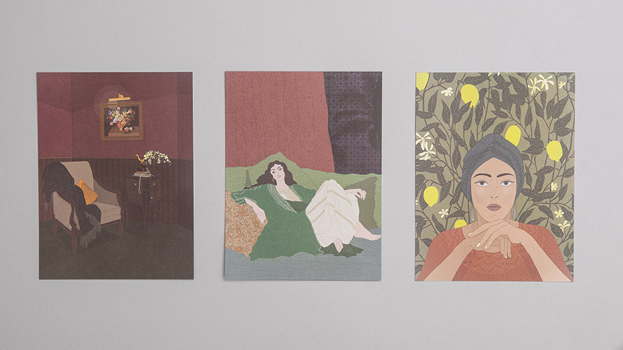
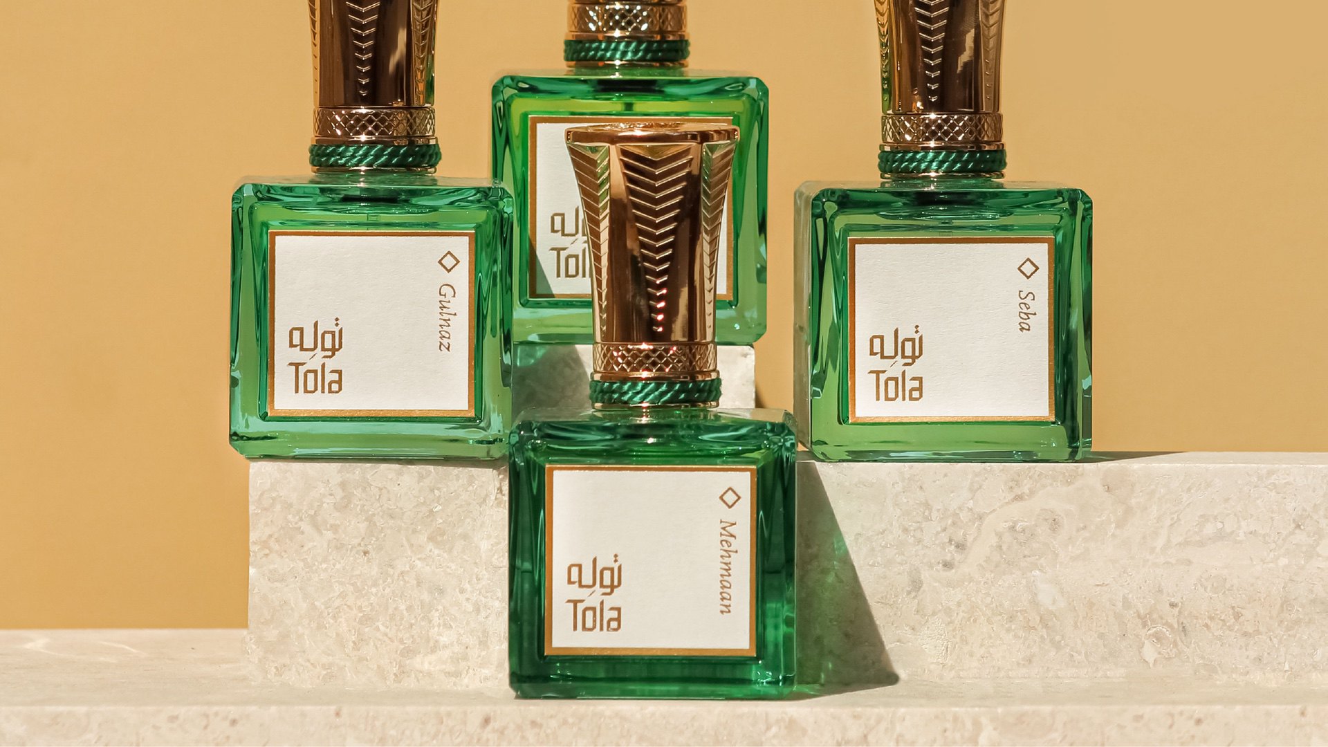
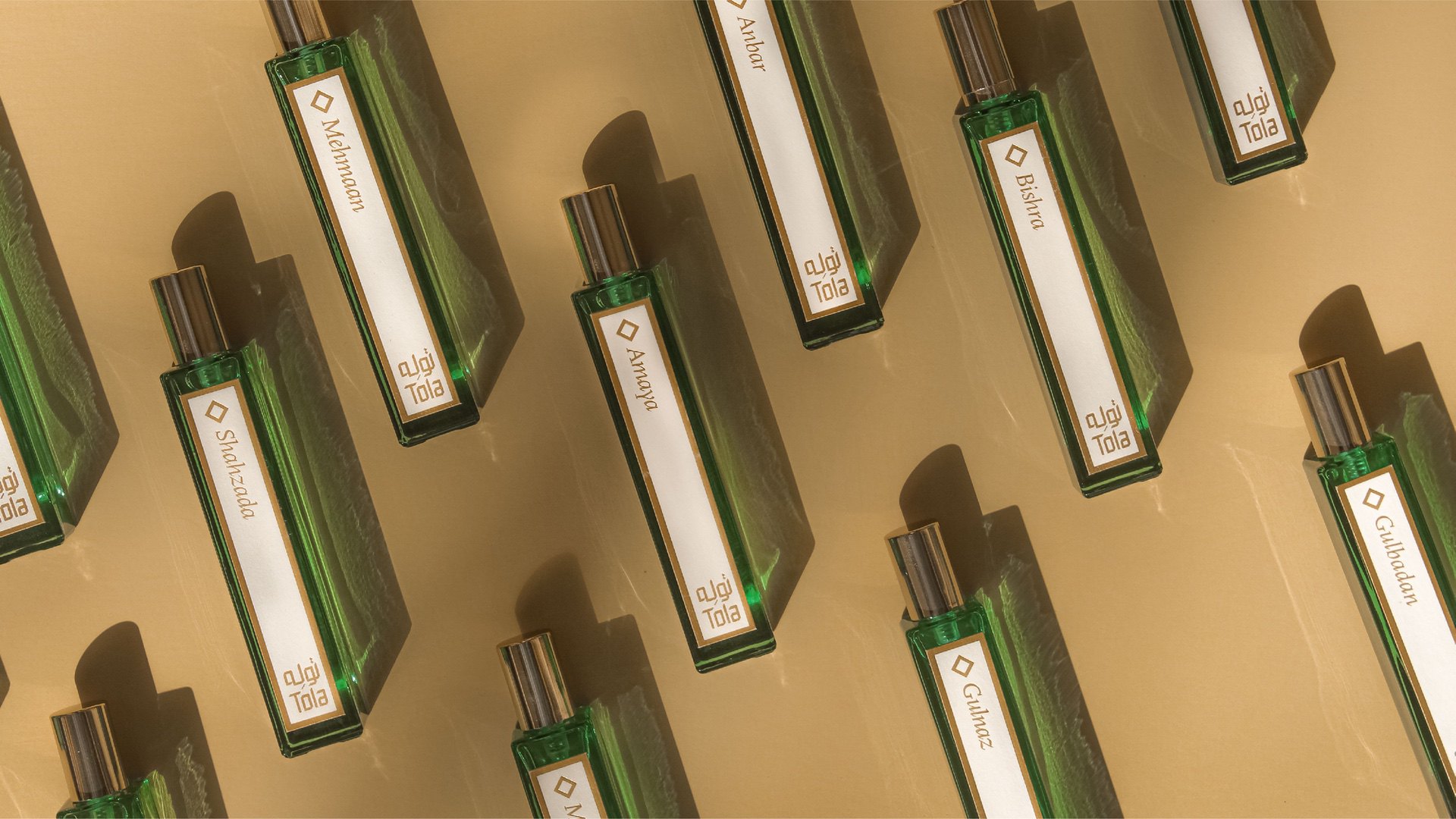
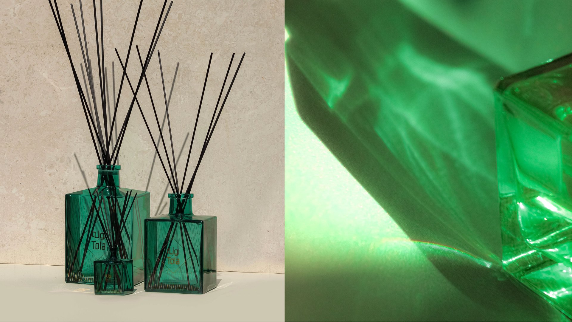
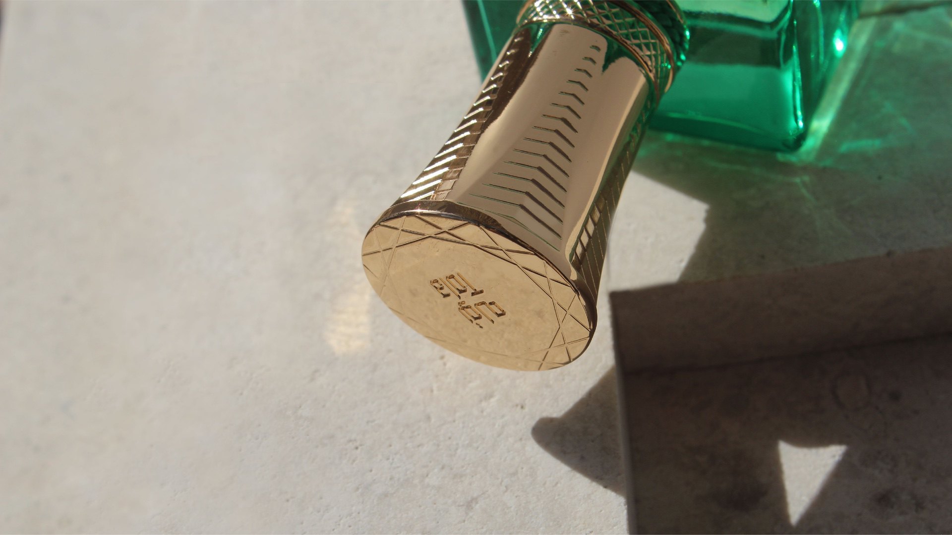
The concept for this Emirati niche perfumery's identity was derived from the Tola coin; an old unit of measurement that is still used today to weigh oriental perfumes. While the Tola coin is essentially round, the logotype developed is systematic in approach and geometric in appearance. This echoes the hidden geometry within Islamic calligraphy in a modern way. The typographic style is inspired by square Kufic calligraphy and hence, the Latin letterforms are based on a grid system, giving them a somewhat exotic feel. The illustration style used for Tola is reminiscent of Art Deco posters from the 1920s and 30s.